Phase Form Editor
Introduction
Phase form editor fields must be defined in the phase configuration under the phaseDefinition.items key. Each field is an array node under items and the index of each form element must be unique. Eg.:
# phaseFile.yml
phaseDefinition:
    items:
        sample:
            text:       Sample field    # label
            fieldName:  SampleField     # model field to store data into
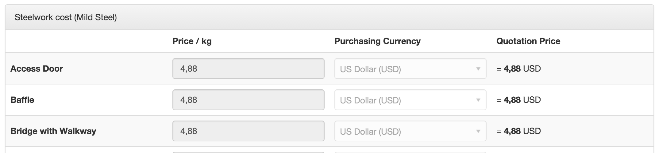
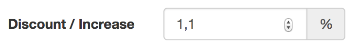
This will produce the following result:

If text is omitted, then the array index is used for the label. So this produces the same result as above:
# phaseFile.yml
phaseDefinition:
    items:
        "Sample field":                 # label
            fieldName:  SampleField     # model field to store data into
When using this form, be aware of the unique indexes (a previous field with the same title will be overwritten!).
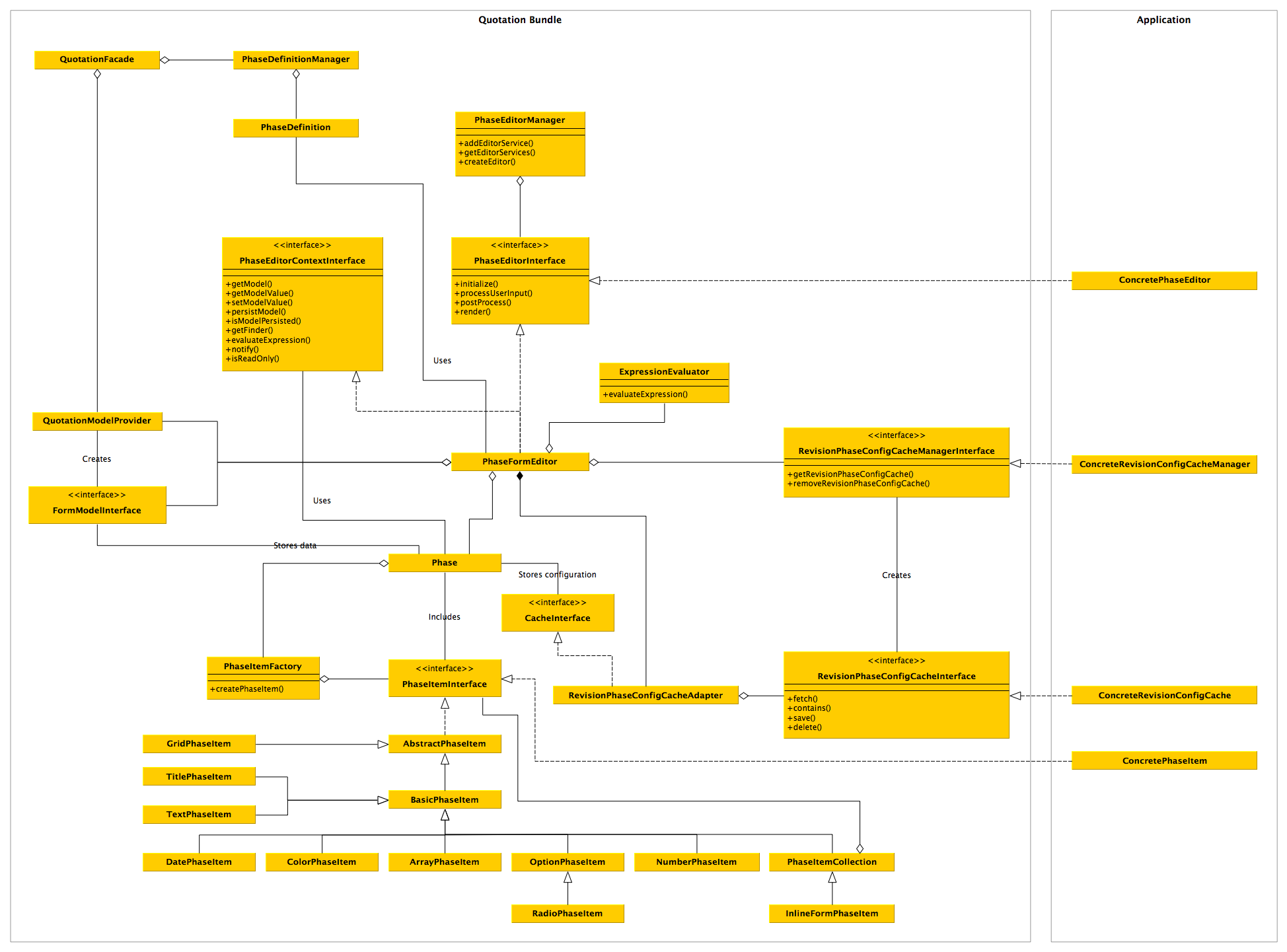
Related Classes
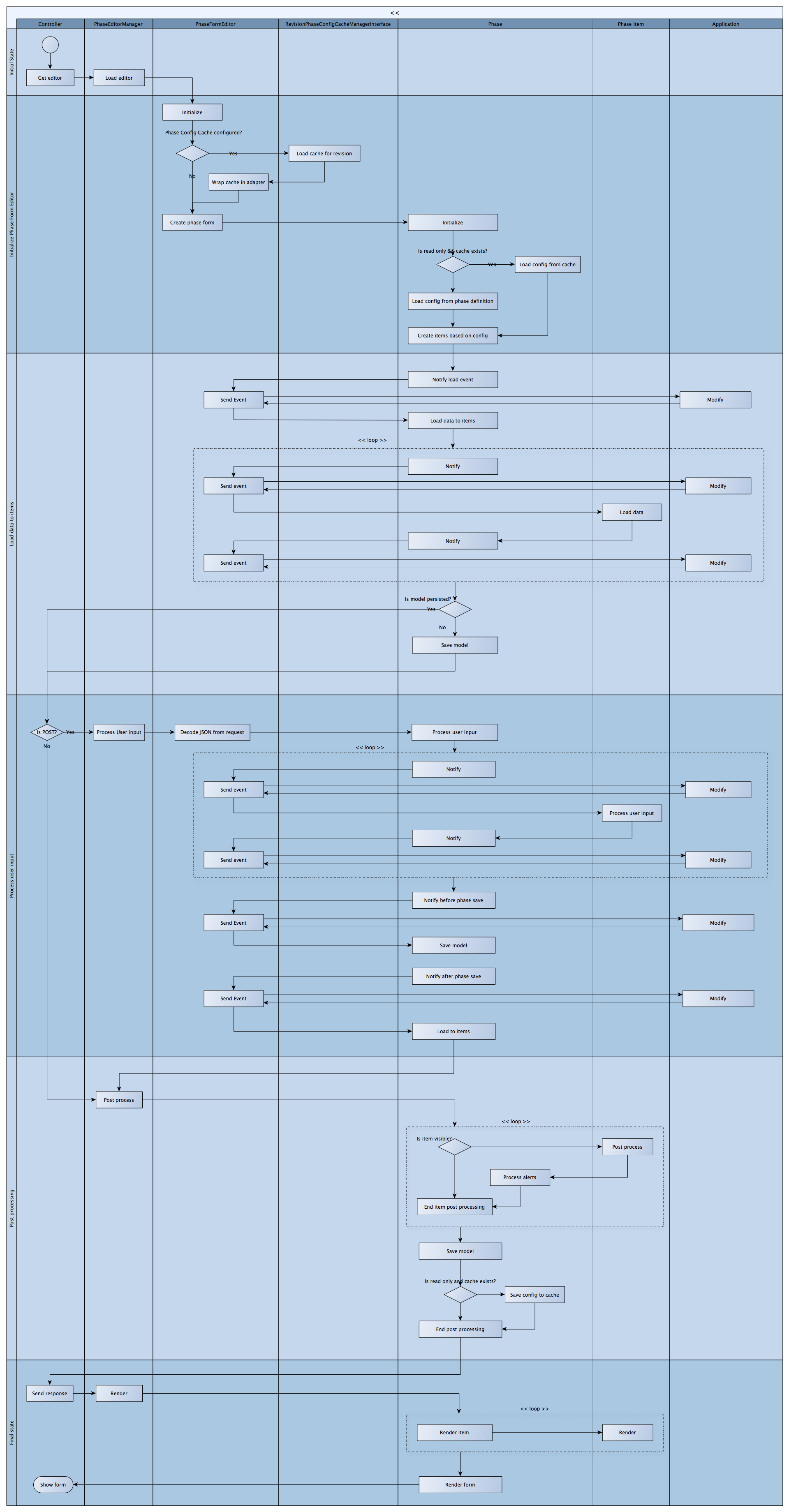
Activity diagram:
Phase events (see Klaro\QuotationBundle\Api\PhaseEvents):
| Event | Description |
|---|---|
| BEFORE_ITEM_SAVE | Triggered while saving the form and right before setting the value of a field |
| AFTER_ITEM_SAVE | Triggered while saving the form and after setting the value of a form field. |
| BEFORE_PHASE_SAVE | Triggered while saving the form and after all the form fields' values have been set but before persisting the form field model. |
| AFTER_PHASE_SAVE | Triggered while saving the form and after persisting the phase model. |
| BEFORE_PHASE_LOAD | Triggered while loading the form and before starting to load values from a form field model to the form. |
| AFTER_ITEM_LOAD | Triggered when the form is loading and setting the value of a field from the form field model. |
| AFTER_PHASE_LOAD | Triggered while loading the form and after values have been set on the form. |
Phase Config Cache
For revisions which are in read-only state, the phase configuration is cached. Depending on the implementation this might be stored in the database or in memory. The config cache provider is set in the configuration under the key klaro_quotation.phase_config_cache_provider.
Custom Phase Items
To use custom phase items, add your phase items as services with the name klaro_quotation.phase_item. Phase items should implement interface in Klaro\QuotationBundle\Api\PhaseItemInterface but in practice it will be easier to use Klaro\QuotationBundle\Phase\AbstractPhaseItem or Klaro\QuotationBundle\Phase\BasicPhaseItem as a base class. These classes provide implementations to most methods to avoid repeating code.
Item config
Fields can have other parameters as well, see below for list. Only the label (text) is mandatory but you will also need fieldName if you want to persist the data. Below are the basic options for each field. Some fields have also some extra parameters which are listed below for each type separately.
| Option | Type | Notes |
|---|---|---|
| text | string | Form field label. |
| fieldName | string | PHP name of the model field where to data is saved. |
| default | string/condition | Field default value |
| type | string | Field type, possible values are: "title", "text", "number", "date", "checkbox", "radio", "dropdown", "inlineForm", "array" |
| options | array | Array of options. Options can also have conditions. |
| filterOptions | array | Array of filters to pass to the option query. Filters may utilize conditions as well. |
| disabled | boolean | Disables the input |
| optional | boolean | Adds a checkbox before this input that shows or hides the input |
| hideLabel | boolean | Choose whether to show or hide the label |
| indent | int | |
| template | string | Override the default template |
| condition | string | Condition to evaluate to decide whether the field is show or not, see "Conditions and dynamic values". |
| alerts | array | Array of condition objects, see "Alerts" |
| overrides | array | Overrides the field configuration. Enables to use conditions for overrides. See "Overrides". |
| width | string | Width of the item. If a numeric value is provided, it assumed to be in pixels. For percentages, use eg. "50%". |
| colWidth | number/array | A number or an array of numbers between 1-12 that correspond to Bootstrap grid column sizes. If this is a number, a col-x-* class is added where * is the colWidth value and x are the grid sizes (xs, sm, md and lg). To manually set column widths, define colWidth as an array, such as { 'sm' : 3, 'md' : 6 }. This allows you to set the grid widths differently according to resolution. |
| vars | array | Array of variables that are passed to the phase item. See "Vars" below. |
| jsHandlers | array | Work in progress (please document). |
| cssClasses | array | Array of css classes applied to main level of field. |
If type is omitted, the default form field type is a textfield (type: text).
Deprecated field options:
| Option | Type | Notes |
|---|---|---|
| prerequisite | string | Condition to evaluate to decide whether the field is show or not. |
Vars
Sometimes it is necessary to pass information to the phase item, especially when using custom phase items. The vars is an array of variables that are passed to the phase item. It can be either a simple key-value list or a list of evaluated values.
"Example":
    fieldName:      ExampleField
    vars:
        first:      1
        second:     2
Extended syntax:
"Example":
    fieldName:      ExampleField
    vars:
        first:      { value: 1 }
        second:     { value: '2 + 1', evaluate: true }
Overrides
You can provide overrides for certain config values by defining an array consisting of a (possible) condition and the key to override. For example, you can override the default value by setting:
"Example":
   fieldName:        ExampleField
   default:          0
   overrides:
       - { condition: 'model.OtherField == 1', default: 1 }
In this case, the default value 1 is set if the value from OtherField is 1 and 0 otherwise. Default value is only overridden if the default key is present and only set when the field is not already set (ie. the value is null).
You can use expressions in the values as well, just add the evaluate flag. The value is then treated as an evaluated string.
Value can be overridden, eg for formatting purposes. However, the value is not saved automatically - the value is sent when the form has been modified.
"Example":
   fieldName:        ExampleField
   overrides:
       - { value: 'value + 2', evaluate: true }    # add 2 to the current value
Options and option texts can be overridden with the following syntax:
"Example":
   fieldName:          ExampleField
   type:               dropdown
   generateOptions:    true
   optionsSourceType:  model
   optionsSource:      SomeModelFinder
   overrides:
       - { options: { none: "-- Choose --" } }
       - { optionTexts: { 1: "Overridden text for value 1" } }
Conditions can be omitted - if present, overrides take effect only when the condition is truthy.
Alerts
It is possible to define alerts and boundaries for fields. You can define many alerts which can be either errors, warnings or info messages. The condition object consists of a condition and a message which is show when the condition is met. Use error, warning or info to specify the message type.
For example:
"Example":
    fieldName:        ExampleField
    alerts:
        - { condition: "value <= 0", error: "Value must be greater than zero" }
        - { condition: "value > 0 && value <= 10", info: "This value is OK" }
        - { condition: "value > 10", error: "Value must be less than 10" }
In the condition, you can use the fields defined in "Item config" (such as default or options) as well as value to refer to the current input value.
In other words:
- Show an error when the value is below zero
- Show an error when the value is above 10
- Show an info message when the value is between 0 and 10
You can also add the flag evaluate to evaluate the message as an expression. This is useful if you want to use model values inside the message.
"Example":
    fieldName:        ExampleField
    alerts:
        - { condition: "value <= model.Limit", error: '"Value must be over " ~ model.Limit', evaluate: true }
Options array
The option array key defines the value of the selected option. The option text is defined in key text.
| Option | Type | Notes |
|---|---|---|
| text | string | Option text value |
| condition | string | Condition to decide whether option is shown or not. See "Conditions and dynamic values" |
Deprecated:
| Option | Type | Notes |
|---|---|---|
| prerequisite | string | Condition to decide whether option is shown or not. Use conditioninstead. |
Filter Options array
The filter option array key defines the field to be filtered. The filter value is defined in key value.
| Option | Type | Notes |
|---|---|---|
| value | string | Filter value |
| condition | string | Condition to decide whether option is shown or not. See "Conditions and dynamic values" |
Deprecated:
| Option | Type | Notes |
|---|---|---|
| prerequisite | string | Condition to decide whether option is shown or not. Use conditioninstead. |
Conditions and dynamic values
Each form field, option or option filter can have a condition which can be used to determine if the field should be displayed or not. The conditions use the Symfony Expression Language component (http://symfony.com/doc/current/components/expression_language/syntax.html). Use model to reference a field from the same model. If the expression evaluates as true then the field or option is shown. For example:
items:
    "First":
        fieldName:        FirstField
        default:          no
        options:
            no:
                text:     Hidden
            yes:
                text:     Visible

     "Second":
         fieldName:       SecondField
         condition:       'model.FirstField == "yes"'
In the above example, the second field is shown only if the Visible option is selected. Ternary operators and operators such as in and not in can also be used. Refer to Symfony documentation for full list of supported operations. For example:
condition:    '(model.Field) ? 1 : 0'
conditiom:    'model.Field in [1, 2, 4, 8]'
To reference a field from another model, use models.SomeModel.FieldName.
When filtering items, you can use dynamic values for the filters in the same way as conditions. For example:
items:
    "First":
        fieldName:        FirstField

    "Second":
        type:                 dropdown
        fieldName:            SecondField
        optionsSource:        SomeModelItemProvider
        optionValueSource:    Id
        optionTextSource:     Name
        filterOptions:
            Name:
                value:        'model.FirstField'
The following objects are available while evaluating conditions:
| Object | Description |
|---|---|
| model | The current phase model |
| models | All phase models, use models.phaseId.Field to access fields from other phases. For nested phases use models["phaseId/subPhaseId"].Field. If a phase is repeatable, you must use array access for models.phaseId[0].Field to get the correct sub model. By default, the first sub model is always returned. |
| quotation | The current quotation, use like quotation.ProductLine == "FP" |
| revision | The current revision |
| configuration | The configuration manager. To load a configuration obejct, use configuration.my_object. This would load a configuration object with the alias my_object. |
| user | The current user, use like user.FullName |
| this | Reference to the phase handler object itself, maybe useful for development - otherwise don't use. |
| request | The current request object, if available. |
To add more objects to evaluation context, see Extending services.
Form field types
Title
This field is not an input but it can be used to insert titles and text the break the form into sections.
items:
    "Title text":
        type:            title
        titleLevel:      2
| Option | Type | Notes |
|---|---|---|
| titleLevel | int | Title level, 1 being the biggest (also default) |
Text input
Generates a text input (oneline or textarea).
| Option | Type | Notes |
|---|---|---|
| default | string | Field default value |
| size | string | Text field size as (columns)x(rows). If rows > 1, then a textarea is shown. |
| unit | string | A unit to show after the value when the field is not focused. Unit is not shown when editing. |
Oneline text input
items:
    "Label":
        type:          text
        fieldName:     ExampleField
Textarea
items:
    "Label":
        type:          text
        fieldName:     ExampleField
        size:          60x4
Number input
Generates a number input (HTML5 number input type). If bounds (min and/or max) are specified, the field will show a tooltip notice. The original value is also preserved if the value is out of bounds when focus moves out of the field. The step option can be given to set the spinner granularity.
| Option | Type | Notes |
|---|---|---|
| step | float | Step granularity for spinner |
| min | float | Minimum value |
| max | float | Maximum value |
| isCurrency | boolean | Display as currency. Eg. 12345.67 -> 12.345,67 |
Option list
Generate a radiobutton group selection. If options are set and no type is given, then the widget is an option list by default.
| Option | Value | Notes |
|---|---|---|
| type | string | "radio" |
| default | string | Option which is selected by default |
| template | string | Override the template if needed (use radio-horizontal for horizontal group) |
| range | expression, array | Options for dropdown, specified by a numeric range array or expression (see below for details). |
| step | int | Step for range option |
| options | array | Array of options. Options can also have conditions. |
| generateOptions | boolean | DEPRECATED: use optionsSource and optionsSourceType instead. |
| itemModel | string | DEPRECATED: use optionsSource and optionsSourceType instead. |
| optionValueSource | string | Name of the model field that provides the value for the option |
| optionTextSource | string | Name of the model field that provides the label for the option |
| filterOptions | array | Array of filters to pass to the option query. Filters may utilize conditions as well. |
| optionsSourceType | string | Options source type: model, parameter, expression or url (see below for descriptions). Default is model |
| optionsSource | string | Model namespace, configuration parameter name or ajax URL that functions as the source for options (see below for descriptions). |
Options source types
| optionsSourceType | optionsSource |
|---|---|
| model | Namespace of the model used to fetch data. Requires also optionValueSource and optionTextValue to be set. |
| parameter | Name of the configuration parameter that provides the values and labels for the generated options. |
| expression | An expression that will produce an array once evaluated. The expression should be defined in optionSource. |
| url | Options will be loaded via ajax from this URL. The response from the URL must be in JSON format. TODO: not implemented yet |
TODO: optionValueSource, optionTextSource, filterOptions are currently only supported with source type model.
Fetching options from a model
Options can be generated from DB model if needed. Define the value and
text source fields with the optionValueSource and optionTextSource respectively.
items:
    "Label":
        type:               radio
        fieldName:          ExampleField
        optionsSource:      SomeModelItemProvider
        optionValueSource:  Id
        optionTextSource:   Name
To filter the query, add a filterOptions array:
items:
    "Label":
        type:               radio
        fieldName:          ExampleField
        optionsSource:      SomeModelItemProvider
        optionValueSource:  Id
        optionTextSource:   Name
        filterOptions:
            Name:
                value:     '"Some name"'    # returns items with Name == "Some name"
Since the filter value is expected to be a condition, use double quotes to input a string (otherwise it is treated as an expression). To add more filters, just add another index to filterOptions.
Fetching options from parameter
To get a list of options from a parameter variable, define the optionsSourceType as "parameter" and put the name of the parameter in optionsSource. The parameter should be an array whose keys will be used for the option values and the values for the option labels.
items:
    "Label":
        type:               radio
        fieldName:          ExampleField
        optionsSourceType:  'parameter'
        optionsSource:      'my_app.parameters.example_options'
Fetching options with an expression
To use expression to get a list of options, define the optionsSourceType as "expression" and put the evaluated expression in optionsSource. The expression should return an array whose keys will be used for the option values and the values for the option labels.
items:
    "Label":
        type:               radio
        fieldName:          ExampleField
        optionsSourceType:  'expression'
        optionsSource:      'models.SomeModel.MyOptions'
Fetching options from url
To fetch options from a URL, set optionsSourceType as "url" and the endpoint URL to optionsSource. When the page loads, a request is sent to this url and the returned options are dynamically loaded to the options list. The endpoint should return a JSON array whose keys will be used for the option values and the values for the option labels.
items:
    "Label":
        type:               radio
        fieldName:          ExampleField
        optionsSourceType:  url
        optionsSource:      /common/api/users?limit=0
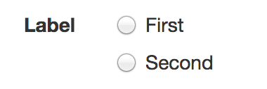
Basic selection
items:
    "Label":
        type:         radio    # may be omitted
        fieldName:    ExampleField
        options:
            1:
                text:    "First"
            2:
                text:    "Second"
If the index value is not important, you could set the options also like this:
options:
    - "First"
    - "Second"
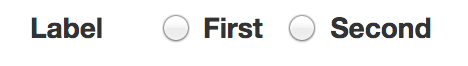
Horizontal option list
items:
    "Label":
        type:         radio
        template:     radio-horizontal
        fieldName:    ExampleField
        options:
            1:
                text:    "First"
            2:
                text:    "Second"
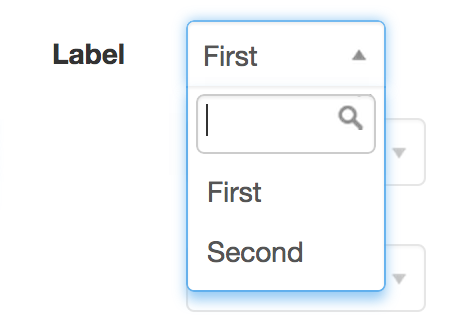
Dropdown
Generate a dropdown menu. The options are the as with option list but use type: dropdown to generate a dropdown.
Basic dropdown
items:
    "Label":
        ui:              dropdown
        fieldName:       ExampleField
        width:           100
        default:         1
        options:
            1:
                text:    "First"
            2:
                text:    "Second"
Like with an option list, options can be generated and filtered from a DB model if needed. See option list config for details.
Range
It is possible to specify options as a numeric array with preferable step (which can be omitted).
A valid value for option can be a numeric range ("start..end" or similar to "[val1,val2,val3,val4]")
or an expression which can be used to call a function of specified model. The function should return an numeric array.
The step option defines the selection of provided array, by showing only those options which index is divisible by step value.
Example 1:
items:
    "Label":
        type:             dropdown
        fieldName:        ExampleField
        range:            "models.get('ExampleModel').get('ExampleField2', 'InputString')"
        width:            60
Example 2:
items:
    "Label":
        type:             dropdown
        fieldName:        ExampleField
        range:            "[7,3,5,1,8,4,6,0]"
        step:             3                     # dropdown will get [7,1,6]
        width:            60
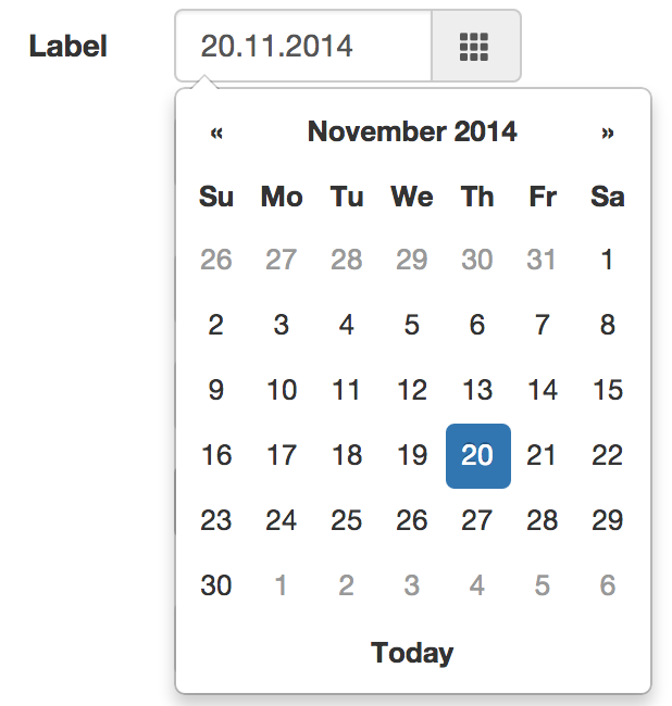
Date
Generates a text field with a datepicker.
items:
    "Label":
        type:           date
        fieldName:      ExampleField
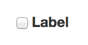
Checkbox
Generates a checkbox selection. Stores a value of "1" if selected. Use hideLabel : true to hide the label.
items:
    "Label":
        type:           checkbox
        hideLabel:      true
        fieldName:      ExampleField
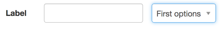
Inline form
Use this option to nest some form fields together. You can use width or colWidth for each item to size the controls.
| Option | Type | Notes |
|---|---|---|
| items | array | Array of form items. |
| showHeaders | boolean | Show form labels over the nested form fields. By default form labels are not shown. |
items:
    "Label":
        type:            inlineForm
        items:
            0:
                type:         text
                fieldName:    FirstField

            1:
                type:         dropdown
                fieldName:    SecondField
                options:
                    - First options
                    - Second option
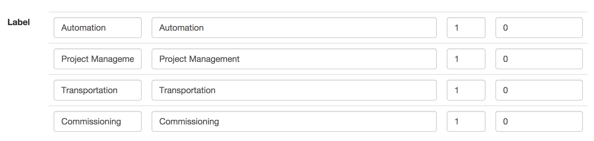
Array
Generates an array of form fields which are stored as JSON into one field. Only text and dropdown items can be defined as fields.
| Option | Type | Notes |
|---|---|---|
| rows | expression | This variable tells the number of rows this array should have. Can be a number or array, or a string which is evaluated as an expression that returns an array. If the array is associative array, the keys are used for values and the values for the title. If this value is missing, the default value is used to set the number of rows. |
| showHeaders | boolean | Show array headers, ie. item's "text" property |
| showTitle | boolean | Show array indexes |
| allowAdd | boolean | Allow adding new rows to table |
| allowRemove | boolean | Allow removing of rows |
| saveAfterLoad | boolean | Save values after loading the page. This is useful is value is already set but default value contains keys which are not present in the value. The UI shows right values but is not saved until making a change on the form. |
| items | array | Item array with type (one of ["text", "dropdown"]), text (header title) and size (column size) |
items:
    "Label":
        fieldName:          AdditionalItems
        type:               array
        default:
            - { code: 'Automation', name: 'Automation', quantity: 1, price: 0 }
            - { code: 'Project Management', name: 'Project Management', quantity: 1, price: 0 }
            - { code: 'Transportation', name: 'Transportation', quantity: 1, price: 0 }
            - { code: 'Commissioning', name: 'Commissioning', quantity: 1, price: 0 }
        items:
            code:
                text:     "Item Code"
                type:     text
                size:     2

            name:
                text:     "Item name"
                size:     6

            quantity:
                text:     "Quantity"
                type:     text
                size:     1

            price:
                text:     "Price"
                type:     text
                size:     2
Grid
Grid editor is a way to include nested forms inside an editor page. The forms are in a table and with each row consisting of its own phase editor and model. The items for each row can be defined in the fields items key or in a separate file.
| Option | Type | Notes |
|---|---|---|
| rows | expression | This variable tells the number of rows this array should have. Can be a number or array, or a string which is evaluated as an expression that returns an array. If the array is associative array, the keys are used for values and the values for the title. If this value is missing, the default value is used to set the number of rows. |
| model | string | A model name that is used to save data for each row. |
| filters | array | An array of filters to get a model for each row. See below for options |
| panel | boolean | Show a panel around the grid editor table. |
| panelHeader | boolean | Show a panel header, contains the item's "text" property |
| showHeaders | boolean | Show array headers, ie. item's "text" property |
| showRowHeaders | boolean | Show or hide just the row headers. |
| showColumnHeaders | boolean | Show or hide just the column headers. |
| definition | string | Path to item definition file in relation to project root folder. |
| items | array | Item array with item definitions, any type of field is available including alerts and notices. |
| emptyText | string | Text to show when no rows are found. |
The rows variable defines either the number of rows or an array which gives the grid rows. If an array, the keys are used as the internal value of the row and values are used as the labels.
If there is more than one grid row, the filters array is needed to get a single model for each row. By default, filters are treated as key-value pairs but you can also evaluate the value by providing an array like this:
filters:
    Module:    { value: 'model.SomeField', evaluate: true }
The key defines the model field and the value is a condition that is evaluated to get a value. The variable rowIndex can be used to get the current row index for each row. For example:
"Example":
    type:         grid
    model:        ExampleModel
    filters:
        Module:     'AREA'
        Row:        { value: 'rowIndex', evaluate: true }
This would get a model that is connected to the current quotation and phase and with "AREA" as its Module property and the grid wor as the "Row" value. If the model does not exist, it is automatically created.
If you use an expression in the filter whose value cannot be cached (for example a value depending on the request object), set the cache flag to false. Eg.
filters:
    Module:     'AREA'
    Row:        { value: 'reguest.get("row")', evaluate: true, cache: false }
The item file format for definition parameter is similar to the phase form file, so items are defined under phaseDefinition.items:
# grid row definition file
phaseDefinition:
    items:
        first:
            text:        "First Field"
            type:        text

        second:
            text:        "Second field"
            type:        dropdown
            options:
                ...